


|
|
|
|
|
|
| |
| 07-MAY-2010 | |
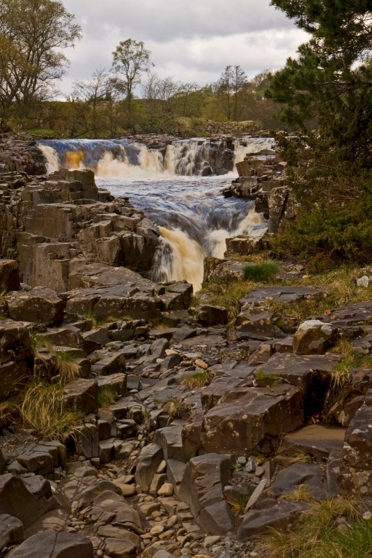
Low Force, upper Teesdale
All images are copyright. Do not use without my permission.
| Roe.. | 05-Oct-2010 10:25 | |
| Guest | 27-Jul-2010 08:29 | |
| s_barbour | 08-May-2010 23:53 | |
| Guest | 08-May-2010 19:50 | |
| Johnny JAG | 08-May-2010 18:22 | |
| Colin Storey | 08-May-2010 18:13 | |
| Michael J. Parkinson | 08-May-2010 16:28 | |
| Kevin Chester | 08-May-2010 14:49 | |