photo sharing and upload picture albums photo forums search pictures popular photos photography help login
Kevin Chester | all galleries >> Galleries >> critique > Low Force
previous | next
07-MAY-2010

Low Force

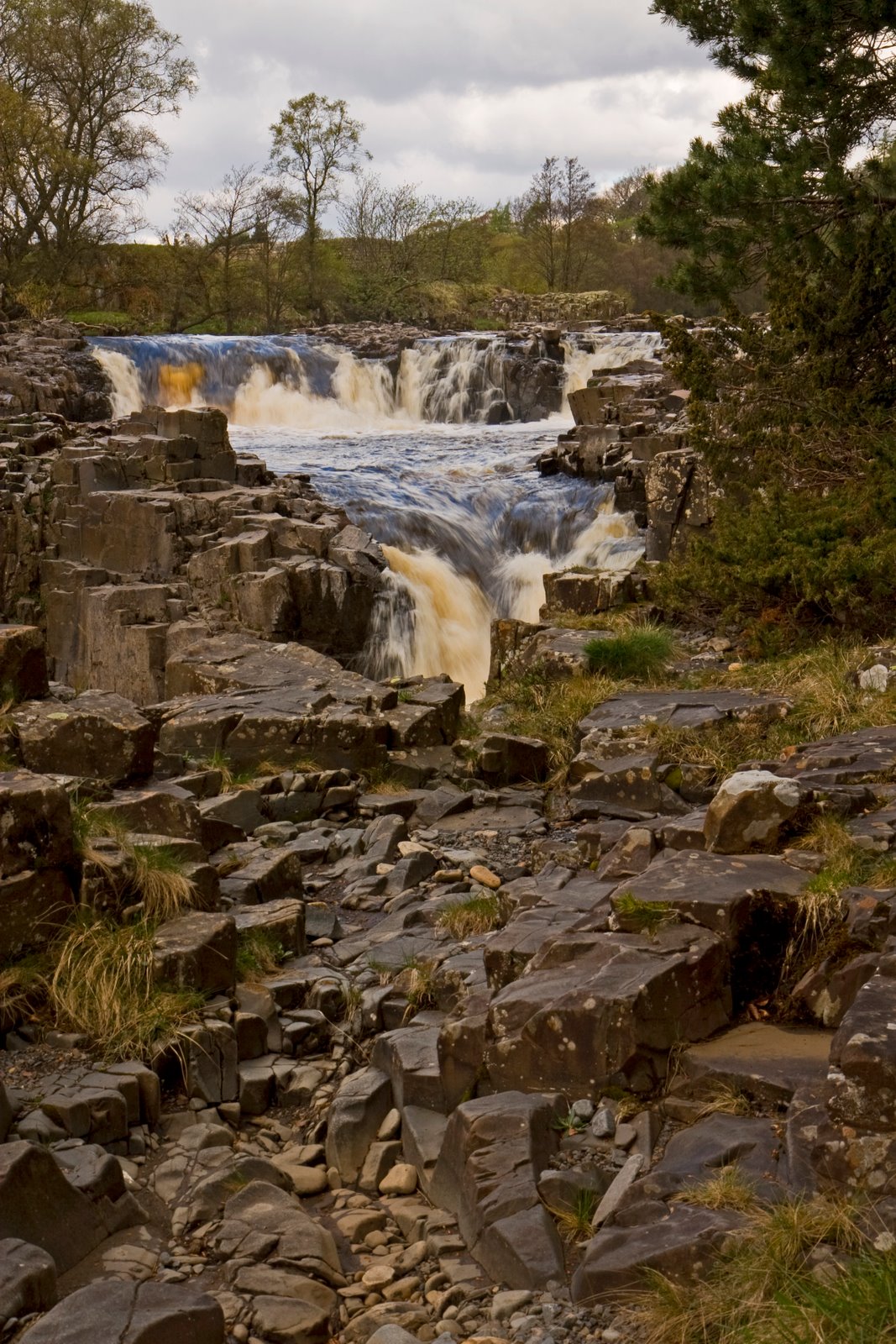
Low Force, upper Teesdale

Canon EOS 30D
1/15s f/13.0 at 33.0mm iso100 hide exif
Full EXIF Info
Date/Time07-May-2010 12:17:07
MakeCanon
ModelCanon EOS 30D
Flash UsedNo
Focal Length33 mm
Exposure Time1/15 sec
Aperturef/13
ISO Equivalent100
Exposure Bias-0.33
White Balance
Metering Modematrix (5)
JPEG Quality
Exposure Programaperture priority (3)
Focus Distance

other sizes: small medium large original auto
previous | next
share
Roe..05-Oct-2010 10:25
I might crop a bit off the top and bottom..you nailed the movement of water..again, my thought is this would make a stunning b&w..the textures of the rocks and light would stand out..
Guest 27-Jul-2010 08:29
In my opinion the foreground and crop work just perfect. The "contrast" between flowing, smooth water and hard edgy rocks, plus also the questionmark, where the water actually goes, make this picture to differ from a basic waterfall/stream shots seen so often.

Anyway, I might have changed the color tone a bit. Even the water isn't so fresh colored, does the whole picture have to be yellowish? Could a colder whitebalance have worked?

I see you use the same type of whitebalance solution in the bridge-photo, but in that one it works better as the blue sky balances the colors.

All in all, nice work ;)
s_barbour08-May-2010 23:53
The waterfall is so beautifully exposed Kevin. I too agree with everyone else, a little too much foreground, however I would leave some of the rocks in the image...they add a great deal of interest.
Guest 08-May-2010 19:50
It would suit a tired walker with sandwiches and a flask to fill the foreground
Johnny JAG08-May-2010 18:22
It needs a canoeist or two
Colin Storey08-May-2010 18:13
I like the image but agree about too much foreground, you miss where the water is falling to, it looks as though its going down a hole. Col
Michael J. Parkinson08-May-2010 16:28
I'm with you on this one Kevin. The foreground tends to stop the eye rather than lead it into the image. A square crop of the top portion will focus on the falls. That said I boosted it up to original size and much prefer a 5-4 ratio getting rid of almost all of the bottom portion.
Kevin Chester08-May-2010 14:49
I'm not sure about this one myself, its in my Critique Gallery so please feel free to let rip with any criticism. I was trying to create a lead in with the foreground but I'm not sure it has worked 100%. I also pondered if a square crop would have been better?
Type your message and click Add Comment
It is best to login or register first but you may post as a guest.
Enter an optional name and contact email address. Name
Name Email
help private comment