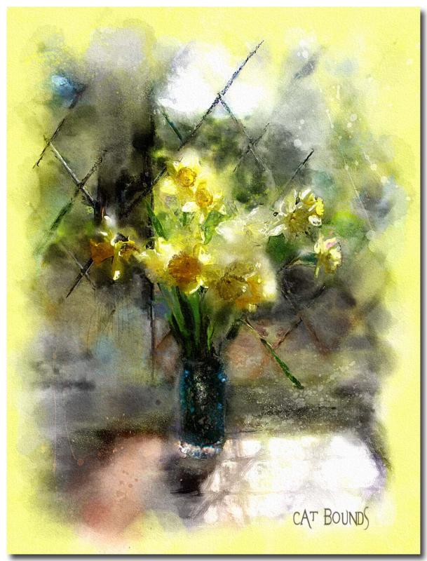
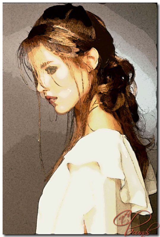
Watercolor-Daffodils.jpg
Jola, I decided to answer your questions here, and I've added a thumbnail link to a painting I did of Jude Law using Art History in a different style.
Art History is one of my favorite tools in PhotoShop. There are many different techniques for using it; sometimes I work in layers or onto a solid, filled layer above the original, but for these two examples, I worked directly onto the original photo.
If I'm trying for a watercolor effect, I usually add a border because traditional watercolors are done on paper, and the painted area sometimes has irregular edges. I often make a white border 1 or 2 inches wide, but for this one the yellow seemed to work. And of course, do your tweaking before you begin painting. This may involve cropping, sharpening, simplifying some areas, removing elements that are distracting, even changing colors.
The Art History Brush tool uses a history state or snapshot as its data source.
In the History Palette, click on the arrow in the upper right corner to get a drop down menu and click on "new snapshot". A snapshot will appear in the list with a brush icon beside it. (If at any time, you don't like how the painting is going, just click on the snapshot, and you're instantly back to the original.)
Select the Art History Brush tool.
In the upper left hand corner, you will see the Art History Brush icon; click on the drop down menu and choose a brush preset. There are a number of presets that come with PhotoShop, but once you become familiar with this tool, you can create your own presets and save them to this library. You can also download some excellent presets from Trimoon's website.
Spend some time playing with the various presets to learn what effects you can create. When I begin a painting, I start with a preset that's loose and set the size pretty large to make an underpainting. This takes a leap of faith as you watch your detailed photo change into color blobs. Don't just make random strokes, though; paint the image because the brush picks up individual colors and shapes from each area. Be patient and enjoy the process. I think one reason some people dislike Art History is because it's literally painting one stroke at a time, not like filters that work their magic with one click. AH is very Zen, just like holding a "real" paint brush.
Change your brush and gradually begin working smaller and in more detail but remember that it's often more "painterly" not to reveal too much detail. In the daffodil painting, I also decided I wanted some paint spatters and did this with PhotoShop brushes "dipped" in colors within the painting. Then I took it to Corel Painter to soften some areas, but if you don't have Painter, this can be done almost as easily in PhotoShop by returning to larger, softer brush presets.
I finished up by applying a pattern overlay from one of the PhotoShop Wow! books and then added a sandstone texture. I like the overlay because it adds a bit of a watery feel, but I used it sparingly, set to soft light at 21%.
I hope this makes sense. Ask questions if any of it is unclear.
cat
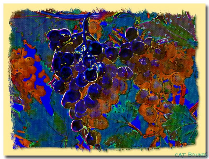
Grape-fabric.jpg
I'll answer your question here, Cindy: I began with a photograph from Stock Xchange and played around with several filters, including Virtual Painter, Buzz Pro, and Organic Edges in PhotoShop CS. When I liked the over all effect, I layered a fabric scan on top of it to get the texture and then did an edge treatment in PhotoGraphic Edges.
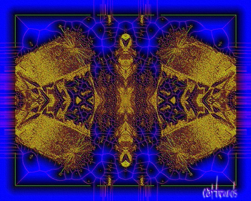
Gold.jpg
This is a fun effect to try with filters in PhotoShop or PaintShop Pro.
Thanks to Phil for reminding me of this Flaming Pear filter called "Veins".
I took a Mardi Gras photo (but try it on lots of different photos for really
wild effects) and I applied Veins, then Simple Filters' "Top Left Mirror",
I tweaked the contrast/brightness and embossed a bit, then added sandstone
texture.
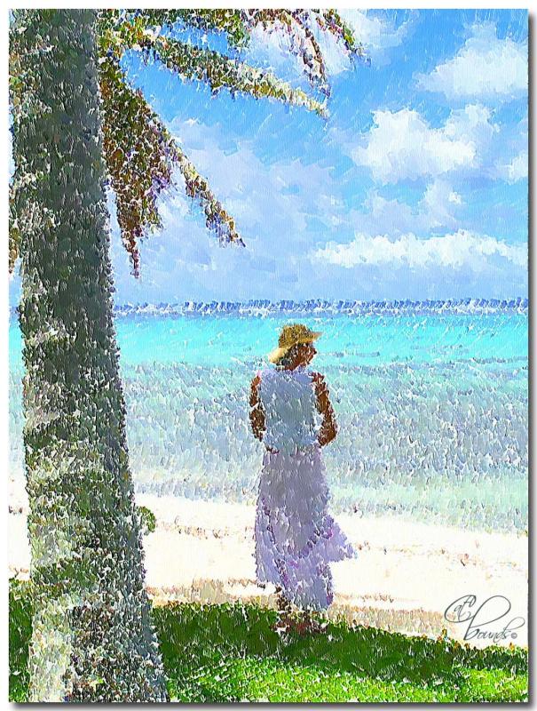
island-girl-copy.jpg
Original photo is from Stock Xchange.
I painted it using PhotoShop CS & Impressionist filters.
I don't really have a tutorial for this one, but if you have PhotoShop and haven't tried the Impressionist plugin, you're missing out on some of the fun. Impressionist is actually obsolete, but a few people like Trimoon
http://www.trimoon.com/html/downloads.html
have kept it alive. You can download the plugin for free from Trimoon's site and add a lot of
awesome presets at Retouch Pro. The preset I created for this painting is posted there to be downloaded if you go to the forum and do a search for "Impressionist Presets".
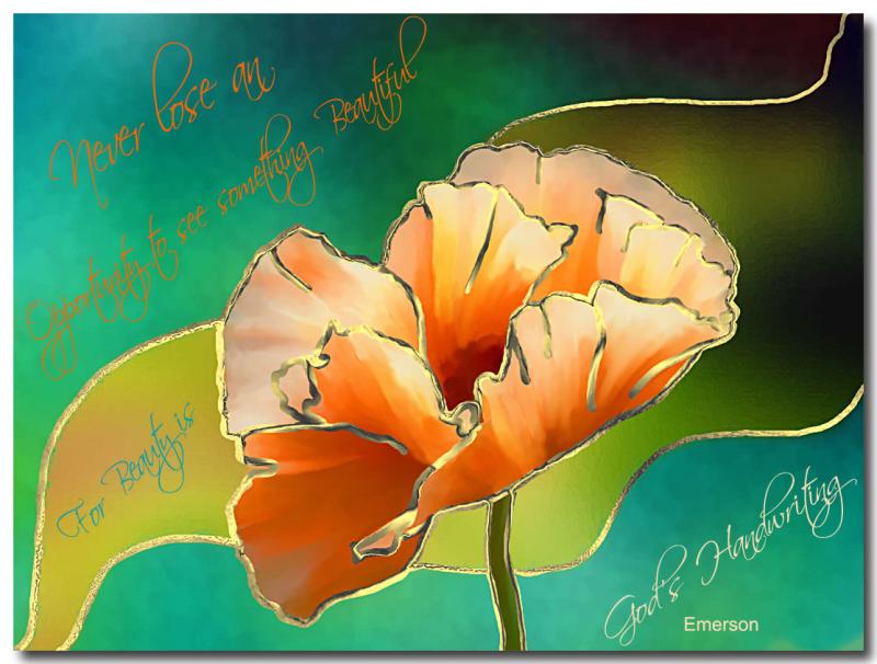
Beauty.jpg
I began with 2 copyright free photos.
My art is copyrighted.
Tutorial:
This painting was done the same as the painting I did here
http://www.pbase.com/image/50877003
This could be done a number of different ways. Here's one:
I needed to start with a simple image, and I gave it a new background that I made from an undersea pic, selected an area of it to re-color and played with colors and a few effects.
I used Buzz Pro to simplify the poppy, then into Painter IX, where I used the Just Add Water brush to blend it even further.
Then to PaintShop Pro, where I made a layer underneath this one and applied Effects/artistic/chrome/golden2 (preset) to it, but this technique could use other metalic layers or even black or white for other interesting looks.
Then I erased through the top layer, outlining the flower and the selection. I think a narrower outline would look better, but I wanted it to show up well here. I found a quote I liked and used Free Transform to move my text around.
If any of this is unclear, leave me a message here on PBase, and I will try to answer it.
Happy painting!
Vandesperre-in-Gold-Leaf.jpg
Original is by Didier Vanderperre, who has copyright to it and all resulting art.
It was posted at Innographx Forum as a digital art challenge.
I painted it using PhotoShop CS & Painter IX.
Tutorial:
This painting was done the same as the poppy painting I did here
http://www.pbase.com/catbounds/image/50986937
This could be done a number of different ways. Here's one:
I needed to start with a simple image, and I gave it a new background that I made from an undersea pic, selected an area of it to re-color and played with colors and a few effects.
I used Buzz Pro to simplify the poppy, then into Painter IX, where I used the Just Add Water brush to blend it even further.
Then to PaintShop Pro, where I made a layer underneath this one and applied Effects/artistic/chrome/golden2 (preset) to it, but this technique could use other metalic layers or even black or white for other interesting looks.
Then I erased through the top layer, outlining the flower and the selection. I think a narrower outline would look better, but I wanted it to show up well here. I found a quote I liked and used Free Transform to move my text around.
If any of this is unclear, leave me a message here on PBase, and I will try to answer it.
Happy painting!
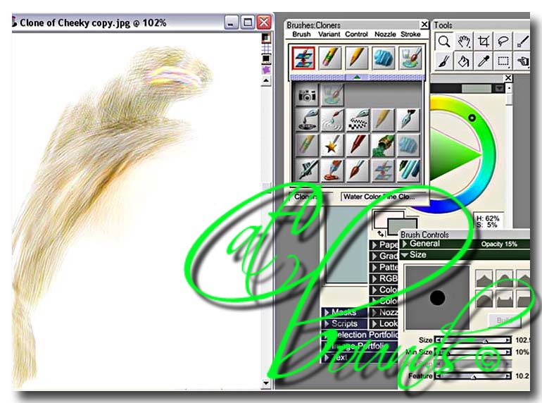
Painter 7 watercolor Cheeky.jpg
Original Photo is the property of Ken Chambers
and was posted at Innographx as a digital art challenge.
I painted it using Painter 7
I use an Intuos 3 tablet. If you haven’t done so already, go into your preferences/brush tracking, and set it in accordance with your own pen pressure. This makes a world of difference, as does the size of the photo in relation to your brush variant settings.
I took Ellisha’s photo into PhotoShop first to resize to about 12 inches wide. The levels were ok, and I sharpened it with USM a little, then brought it into Painter, cloned, and made tracing paper.
The light on her face is coming from her left, so that’s where I wanted the least detail. In real watercolors, I would begin with the line drawing, but I work backwards in Painter and do the colorwash first; that may just be me.
This screen capture shows some of the brush settings, and I zoomed in to show the color variations that the watercolor fine cloner leaves in her hair. (Other settings include wetness 297, pickup 58, dry rate 90, evap. th.81, diffusion 90, well resat 54, and bleed 3) I stroke the brush along the lines of her hair and lightly block in the contours of her face and body. Then I turn off the original layer below to work on details.
The colors I saw in this photo were gold, charcoal, and a peachy pink. I took the eyedropper and selected the charcoal and tweaked it to a soft baby blue for a fourth color. I made a new watercolor layer, chose the flat wash watercolor brush, and began lightly laying down a blue and peach background, also brushing some blue into her jacket. I didn’t much like my results, but I didn’t delete it, just turned it off and made another watercolor layer and tried again. I ended up using them both at 50% opacity.
Next I made another layer for the outline and chose the 2B pencil. I didn’t want my drawing to be overpowering or painfully accurate. I used my artistic license to exaggerate her eyelashes, something I do when painting children, pretty women or gorgeous guys. I indicated strands of hair, outlined portions of her sweater, mouth and hands, but not every square inch of them.
Finally, I gave it a sandstone texture in PhotoShop. Let me know if anything here isn’t clear.
cat bounds
Ellisha Painter setup-.jpg
Painter 7 Tutorial
I use Painter 7 and an Intuos 3 tablet.
I took Ellisha’s photo into PhotoShop first to resize to about 12 inches wide. The levels were ok, and I sharpened it with USM a little, then brought it into Painter, cloned, and made tracing paper.
The light on her face is coming from her left, so that’s where I wanted the least detail. In real watercolors, I would begin with the line drawing, but I work backwards in Painter and do the colorwash first; that may just be me.
This screen capture shows the brush settings, and I zoomed in to show the color variations that the watercolor fine cloner leaves in her hair. I stroke the brush along the lines of her hair and lightly block in the contours of her face and body. Then I turn off the original layer below to work on details.
The colors I saw in this photo were gold, charcoal, and a peachy pink. I took the eyedropper and selected the charcoal and tweaked it to a soft baby blue for a fourth color. I made a new watercolor layer, chose the flat wash watercolor brush, and began lightly laying down a blue and peach background, also brushing some blue into her jacket. I didn’t much like my results, but I didn’t delete it, just turned it off and made another watercolor layer and tried again. I ended up using them both at 50% opacity.
Next I made another layer for the outline and chose the 2B pencil. I didn’t want my drawing to be overpowering or painfully accurate. I used my artistic license to exaggerate her eyelashes, something I do when painting children, pretty women or gorgeous guys. I indicated strands of hair, outlined portions of her sweater, mouth and hands, but not every square inch of them.
Finally, I gave it a sandstone texture in PhotoShop. Let me know if anything here isn’t clear.
cat bounds
lady-artistic-filters.jpg
Original photo is from Stock Xchange.
I painted it in PhotoShop CS for a challenge posted
at Innographx, using only Artistic Filters.
I used Cut out, Paint Daubs and Palette Knife in one
layer and ran Watercolor 3 times, reducing the final application by 50% and set that layer
above the other at about 25% opacity.
TAZ.jpg
This one began as a couple of fractals in Apophysis. I opened them in PhotoShop, layered them in screen mode, duplicated, added a gradient to the bottom one, which gave the whole stack a more opaque appearance, played w/ opacities, flattened and embossed for an impasto effect.
Here's how I emboss; I don't use the emboss filter in PhotoShop.
When you've flattened the layers of your painting, make a duplicate file, desaturate, and save as a psd file. Close that one. Take your file you've been working on and go into Texture/Texturizer, click the little arrow that gives a drop-down that says load texture... Navigate to the folder where you saved the desaturated copy and click on it. Set scaling to 100%, and play with the relief slider, usually around 12% is good, sometimes it looks good to check invert. You can watch all that's happening in the preview window and get it the way you want it.