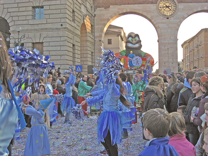
16-FEB-2007
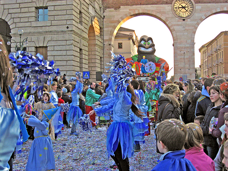
robin-orig-2345.jpg
Robin, this is the original image.
It's almost 700k, which is enormous and will use up
your file space quickly while loading quite slowly
on some DSL machines and will take 3 minutes to load
on a dial-up modem. Probably saved at max-12.
Saving at max-10 or 11 or even high-9 is good enough
for 800x600 and barely different.
There's very little contrast seen via my monitor.
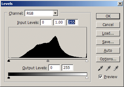
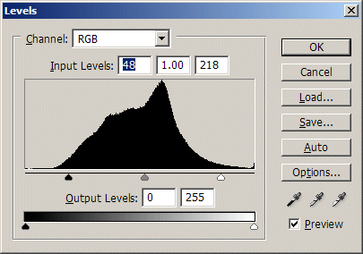
robin-orig-2345-histogram.jpg
This is the histogram for it.
The left side shows no black areas while the
right side shows some brighter-white in decent
amplitude, due to the sky through the arches.
But there is a tall spike at the right edge,
which means the brightest white is too bright
and has no detail. (Could be normal.)
The darkest color here will be gray rather than black
as there is nothing registered in the dark area at left.
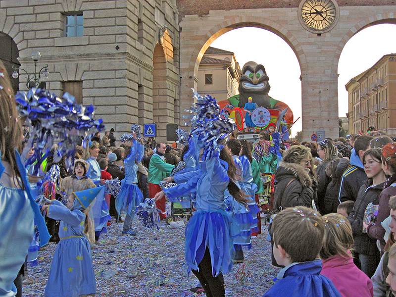
16-FEB-2007
robin-2345-autocontrasted.jpg
Here I used CS's auto-contrast on it.
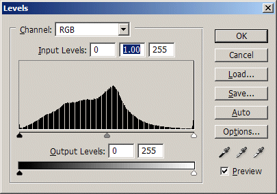
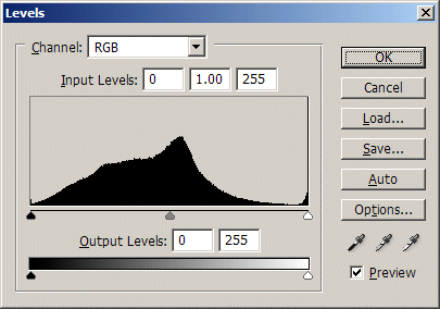
robin-auto-contrast-histogram.jpg
RIGHT after using auto-contrast, I checked Levels,
which now shows some areas that are mildly black.
Photoshop will make the grays go into deeper black
for eye-relief and because in real life there tend to be
real darks. SOMEtimes you may not want that of course.
After contrasting action, there will always be shown
some detail dropped, relative to the original image
still in memory, when you go dark-gray to black, and
bright-grey to white and that's what the white streaks
indicate, in this already downsized photo.
In large originals when you do this (the way to go),
you won't see such a striking difference in lost detail
between the two images current in memory, when
comparing action-results.
16-FEB-2007
robin-2345-manualcontrasted-maskedwhite.jpg
Here I masked the white portions by:
. magic-wanding the white part
. select-inversing it
. select-feather .4 for an 800x600
(might be 5 to 30 for your original)
Then I did a manual Levels move.
In the next pic you see the black-point
sliding lever moving down to 'black' area to include
some currently-gray material in that dark range so
that the darkest-gray then becomes black.
I also moved the white point level marker to get some
other, lighter grays brighter (faces, building surfaces),
but the masking-out of the sky avoids the sky being
affected -- so the sky doesn't get even brighter,
You can click on the pictures to get the larger images. Also you can
open up a new window for each photo to alternate between them.
On your monitor, your original will tend to look better, but the histogram will show you that
for standard monitor settings, the revised ones will look better to people with standardized settings.
Manual-contrasting-action-maskwhite-histogram.jpg
This is the pointer-movement being done.
Black pointer is moved in to include
the darker parts of the gray area (at the start)
where all gray was clumped in the middle only.
I also moved the white pointer, to
include some of the brighter greys
and whiten them more for contrast.
Again, the actual white portions of the
original were masked to protect them
from further whitening.
robin-2345-manualcontrasted-histogram.jpg
This is the resulting histogram after
I closed the file and then re-opened it
so it wouldn't show white lines relative
You see the blacks now are there in small
amounts. The grays still predominate
and there's not TOO much white.
In the final picture, the building surfaces
and faces should be less flat and have a bit
If the blues are too vivid now, that's
because increasing contrast will ALSO increase
color. You can desaturate some then.
Hope that helps!