photo sharing and upload picture albums photo forums search pictures popular photos photography help login
Andrys Basten | all galleries >> Kindle photos for blog >> Kindle DX, K2, and K3 for the Kindleworld blog > Kindle 2 font and Kindle DX with smaller generic font
previous | next
27-JUN-2009 Andrys Basten

Kindle 2 font and Kindle DX with smaller generic font

Berkeley, California area

From a public-domain book on Egypt. For some reason I chose a smaller DX font here too.

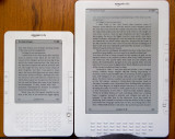
Light from thewindow behind the Kindles was making the top left of the
DX display mainly a glare.

The smaller fonts have less spacing between lines.
If you don't want to read across a wide page, you can choose to add a margin
to get a more column-like layout.  This is a mild margin, and there's
one that makes a very narrow column as well.

Canon PowerShot A710IS
1/30s f/2.8 at 5.8mm iso100 full exif

other sizes: small medium original auto
share
Andrys Basten06-Dec-2009 01:06
Guest,
I'm glad that helped ! I was a bit shocked that I like the DX as much as I do -- I got it for
practical reasons (PDFs) but it's the one I carry around now.
Guest 05-Dec-2009 23:52
Thank you VERY much for displaying both Kindles side by side for comparison, now I know I DEFINITELY need and want the DX! :)
Type your message and click Add Comment
It is best to login or register first but you may post as a guest.
Enter an optional name and contact email address. Name
Name Email
help private comment